Background
We recently published a review on the molecular mechanisms underlying the function of R genes in The Plant Cell. The graphs in the first figure were made in R. Here I will show the R code used to generate these graphs, and a couple of additional graphs that can be made with the supplemental dataset. The dataset used to make the graphs is Supplemental dataset 1.
This code is probably not particularly elegant, but it does the job. Feel free to play around with the data and generate more graphs!
Data
The code requires the tidyverse and readxl from the tidyverse to be loaded.
# Load in the required libraries
library(readxl)
library(tidyverse)

# Load in the supplemental data from The Plant Cell paper (make sure to remove the first row containing the article header)
Data <- read_excel("data/TPC2017-REV-00579R2_Supplemental_Data_Set_1.xlsx", sheet = 1, na = "-")
A little bit about the columns:
| Column | Description | Comment |
|---|---|---|
| Kingdom | Pathogen type | For the review the category auto-immunity and DAMP were dropped |
| Host | Host species in which R gene is cloned | For the review several species were grouped |
| DateReceptor | Date R gene was cloned | For the review one date was chosen in case of multiple components; Column Timeline |
| DateCoreceptor | Date guard/decoy was cloned | For the review one date was chosen in case of multiple components; Column Timeline |
| Status | Whether or not the cloned genes have been shown to be involved in disease resistance | For the review only the category Confirmed was kept, and the category ETIP was counted as loss-of-susceptibility |
| Proposed mechanism | Proposed mechanism | Not always the same mechanism as used in the review, more speculative |
| Review | Mechanism used in the review | Mechanism used in the review, duplicates were removed and only confirmed R genes were kept |
| Timeline | The date the R gene/receptor or the guard/decoy was cloned was used | The first date was chosen, duplicates were removed and only confirmed R genes were kept |
Graphs featured in the paper
For the paper we made four different graphs: a timeline of the cloned R genes according to mechanism, the explanation of the mechanisms, pathogen type vs mechanism, and host species vs mechanism. The graphs were made with the following R code, and further polished in CorelDRAW.
Mechanisms
# Plot the different mechanisms
ggplot(data = subset(Data, !is.na(Review)), aes(x = Review)) +
  geom_bar(fill = c("#5F5F5F", "#D699DD", "#C266CD", "#9900AB", "#8A6B70", "seagreen3", "seagreen4", "#FBB3A9", "#FA8085", "#FA5C59", "#F54029", "#A1A5C9", "#7279AE", "#434C93", "#141F78")) +
  scale_x_discrete(limits = c("Unknown", "Reprogram", "Loss-of-interaction", "Active", "Executor", "NLR-ID; Orphan Receptor", "NLR-ID", "NLR; Orphan Receptor", "NLR; Unknown mechanism", "NLR; Modified Host", "NLR; Receptor-ligand", "RLP/RLK; Orphan Receptor", "RLP/RLK; Unknown mechanism", "RLP/RLK; Modified Host", "RLP/RLK; Receptor-ligand"),
                   labels = c("Unknown", "Altered process", "Loss-of-inter.", "Active", "Executor", "NLR-ID; Orphan", "NLR-ID", "NLR; Orphan", "NLR; Unknown", "NLR; Modified host", "NLR; Receptor-ligand", "RLP/RLK; Orphan", "RLP/RLK; Unknown", "RLP/RLK; Modified host", "RLP/RLK; Receptor-ligand")) +
  scale_y_continuous(breaks = c(0, 10, 20, 30, 40, 50, 60, 70, 80, 90),
                     position = "top") +
  ylab("Number of reported cases") +
  geom_text(stat = "count", aes(label = ..count..),hjust = -0.5) +
  theme(panel.background = element_rect(fill = NA),
        panel.grid.major.x = element_line(colour = "#BFBFBF", size = 0.8),
        axis.ticks.x = element_blank(),
        axis.ticks.y = element_blank(),
        axis.title.y = element_blank()) +
  coord_flip()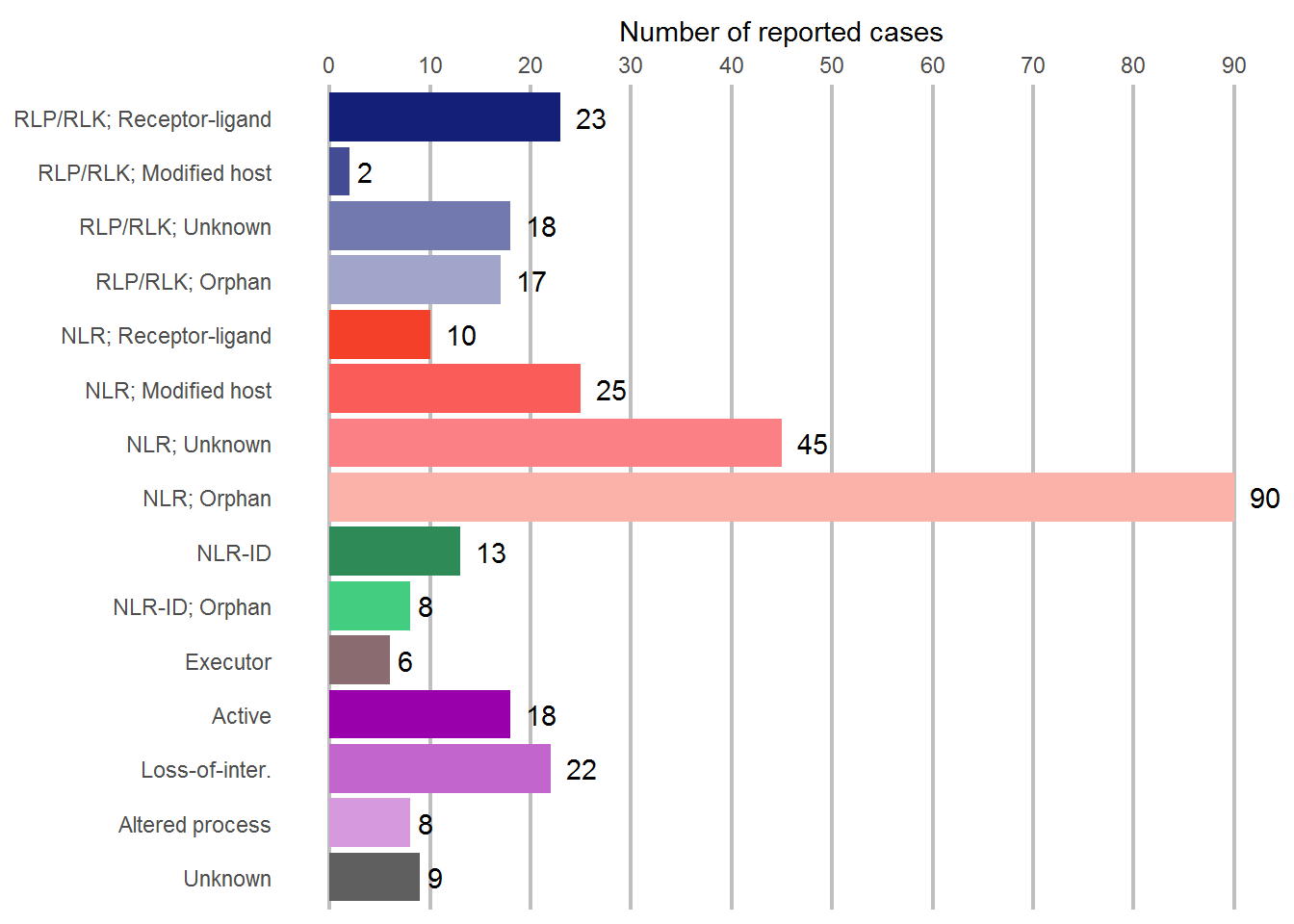
By pathogen
# Make a new dataframe
Kingdom <- Data %>%
  filter(!is.na(Review)) %>% # Remove everything that is duplicated
  group_by(Kingdom, Review) %>%
  summarize(counts = n())

# Order the mechanisms
Kingdom <- transform(Kingdom,
                      Review  = factor(
                        Review,
                        levels=c("RLP/RLK; Receptor-ligand", "RLP/RLK; Modified Host", "RLP/RLK; Unknown mechanism", "RLP/RLK; Orphan Receptor", "NLR; Receptor-ligand", "NLR; Modified Host", "NLR; Unknown mechanism", "NLR; Orphan Receptor", "NLR-ID", "NLR-ID; Orphan Receptor", "Executor", "Active", "Loss-of-interaction", "Reprogram", "Unknown", NA),
                        ordered =TRUE))

# Plot the data
ggplot(data = subset(Kingdom, !is.na(Review)), aes(x = Kingdom, y = counts, fill = Review)) +
  geom_bar(stat = "identity") +
  ggtitle("R genes / pathogen") +
  scale_x_discrete(limits = c("Viral", "Bacteria", "Oomycete", "Plant", "Fungi", "Nematode", "Insect", "Other")) +
  scale_y_continuous(breaks = c(0, 25, 50, 75, 100, 125, 150)) +
  scale_fill_manual(values = c("#141F78", "#434C93", "#7279AE", "#A1A5C9", "#F54029", "#FA5C59", "#FA8085", "#FBB3A9", "seagreen4", "seagreen3", "#8A6B70", "#9900AB", "#C266CD", "#D699DD", "#5F5F5F")) +
  guides(fill = guide_legend(title = NULL)) +
  ylab("Cloned R genes") +
  theme(panel.background = element_rect(fill = NA),
        panel.grid.major = element_line(colour = "#BFBFBF", size = 0.6),
        panel.grid.major.x = element_line(colour = NA),
        axis.line.y = element_line(color = "#BFBFBF", size = 0.6),
        axis.ticks.y = element_line(color = "#BFBFBF", size = 0.6),
        axis.ticks.x = element_line(color = "#BFBFBF", size = 0.6),
        axis.text.x = element_text(angle = 60, hjust = 1, size = 12),
        axis.title.x=element_blank())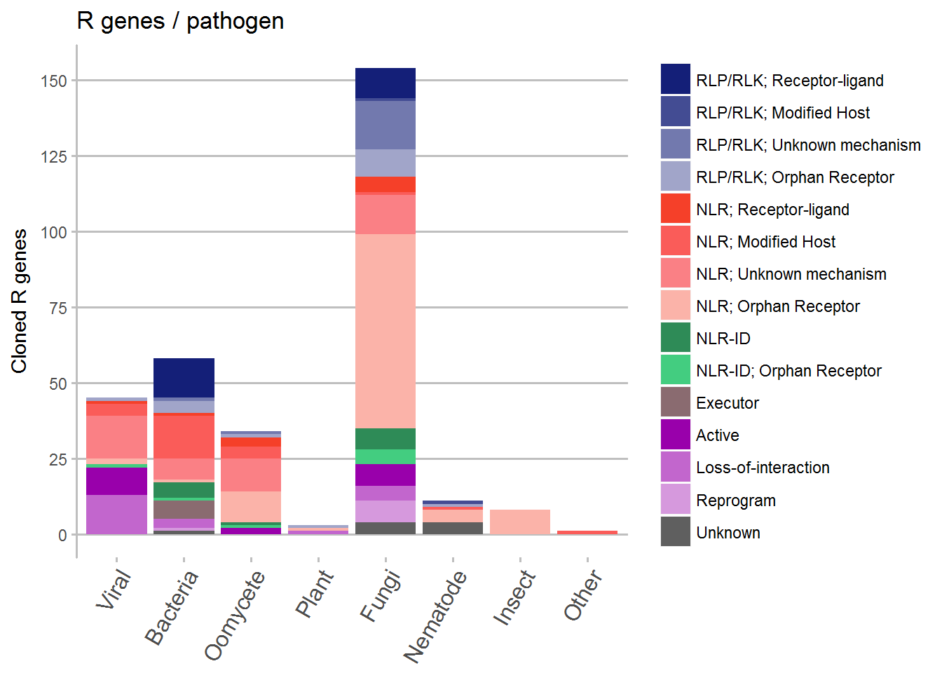
By plant species
Here we grouped several species together to come up with a manageable number to show in a graph.
# Make a new dataframe
Species <- Data

# Rename the species to reduce the number of categories
Species$Host[which(Species$Host == "Nicotiana benthamiana")] <- "Nicotiana"
Species$Host[which(Species$Host == "Nicotiana glutinosa")] <- "Nicotiana"
Species$Host[which(Species$Host == "Tobacco")] <- "Nicotiana"
Species$Host[which(Species$Host == "Eggplant")] <- "Other"
Species$Host[which(Species$Host == "Solanum americanum")] <- "Other"
Species$Host[which(Species$Host == "Cabbage")] <- "Other"
Species$Host[which(Species$Host == "Oilseed rape")] <- "Other"
Species$Host[which(Species$Host == "Pigeonpea")] <- "Fabaceae"
Species$Host[which(Species$Host == "Pea")] <- "Fabaceae"
Species$Host[which(Species$Host == "Soybean")] <- "Fabaceae"
Species$Host[which(Species$Host == "Medicago truncatula")] <- "Fabaceae"
Species$Host[which(Species$Host == "French Bean")] <- "Fabaceae"
Species$Host[which(Species$Host == "Cowpea")] <- "Fabaceae"
Species$Host[which(Species$Host == "Apple")] <- "Other"
Species$Host[which(Species$Host == "Grapevine")] <- "Other"
Species$Host[which(Species$Host == "Hop")] <- "Other"
Species$Host[which(Species$Host == "Myrobalan Plum")] <- "Other"
Species$Host[which(Species$Host == "Black Pepper")] <- "Other"
Species$Host[which(Species$Host == "Norway spruce")] <- "Other"
Species$Host[which(Species$Host == "Sorghum")] <- "Other"

# Make a dataframe summarizing the number of each mechanism per species
Species <- Species %>%
  filter(!is.na(Review)) %>% # Remove everything that is duplicated
  group_by(Host, Review) %>%
  summarize(counts = n())

# Order the mechanisms
Species <- transform(Species,
                      Review  = factor(
                        Review ,
                        levels=c("RLP/RLK; Receptor-ligand", "RLP/RLK; Modified Host", "RLP/RLK; Unknown mechanism", "RLP/RLK; Orphan Receptor", "NLR; Receptor-ligand", "NLR; Modified Host", "NLR; Unknown mechanism", "NLR; Orphan Receptor", "NLR-ID", "NLR-ID; Orphan Receptor", "Executor", "Active", "Loss-of-interaction", "Reprogram", "Unknown", NA),
                        ordered =TRUE))

# Plot the data
ggplot(data = Species, aes(x = Host, y = counts, fill = Review)) +
  geom_bar(stat = "identity") +
  ggtitle("R genes / host") +
  scale_x_discrete(limits = c("Arabidopsis", "Fabaceae", "Flax", "Melon", "Lettuce", "Sugar beet", "Nicotiana", "Pepper", "Potato", "Tomato", "Barley", "Maize", "Rice", "Wheat", "Other")) +
  scale_fill_manual(values = c("#141F78", "#434C93", "#7279AE", "#A1A5C9", "#F54029", "#FA5C59", "#FA8085", "#FBB3A9", "seagreen4", "seagreen3", "#8A6B70", "#9900AB", "#C266CD", "#D699DD", "#5F5F5F")) +
  guides(fill = guide_legend(title = NULL)) +
  scale_y_continuous(breaks = c(0, 10, 20, 30, 40, 50, 60)) +
  ylab("Cloned R genes") +
  theme(panel.background = element_rect(fill = NA),
        panel.grid.major = element_line(colour = "#BFBFBF", size = 0.6),
        panel.grid.major.x = element_line(colour = NA),
        axis.line.y = element_line(color = "#BFBFBF", size = 0.6),
        axis.ticks.y = element_line(color = "#BFBFBF", size = 0.6),
        axis.ticks.x = element_line(color = "#BFBFBF", size = 0.6),
        axis.text.x = element_text(angle = 60, hjust = 1, size = 12),
        axis.title.x=element_blank())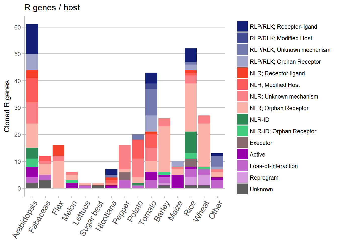
Timeline
For the timeline a bit more coding was required in which a new dataframe with the cumulative counts of the different mechanisms.
# Create a new dataframe
data.count <- count(Data, Timeline, Review)

year <- c(1992:2017)
review <- unique(data.count$Review)[1:15]
year.list <- c()
review.list <- c()
n.list <- c()

for (y in year){
  for (r in review){
    year.list = c(year.list, y)
    review.list = c(review.list, r)
    if (length(data.count$n[which(data.count$Timeline==y&data.count$Review==r)])==0){
      n.list = c(n.list,0)
    } else{
      n.list = c(n.list, data.count$n[which(data.count$Timeline==y&data.count$Review==r)])
    }

  }
}

Timeline <- data.frame(Timeline = year.list, Review = review.list, count = n.list)

rm(data.count)
rm(n.list)
rm(r)
rm(review)
rm(review.list)
rm(y)
rm(year)
rm(year.list)

Timeline <- Timeline %>%
  group_by(Review) %>%
  mutate(running_total = cumsum(count))

# Order the different mechanisms so that they show up in the right place in the stacked graph
Timeline <- transform(Timeline,
                    Review  = factor(
                      Review ,
                      levels = c("RLP/RLK; Receptor-ligand", "RLP/RLK; Modified Host", "RLP/RLK; Unknown mechanism", "RLP/RLK; Orphan Receptor", "NLR; Receptor-ligand", "NLR; Modified Host", "NLR; Unknown mechanism", "NLR; Orphan Receptor", "NLR-ID", "NLR-ID; Orphan Receptor", "Executor", "Active", "Loss-of-interaction", "Reprogram", "Unknown"),
                      ordered = TRUE))

# Plot the dataframe
ggplot(data = Timeline, aes(x = Timeline, y = running_total, fill = Review)) +
  ggtitle("Timeline of cloned R genes") +
  geom_area(position = "stack") +
  xlab("Year") +
  scale_fill_manual(values = c("#141F78", "#434C93", "#7279AE", "#A1A5C9", "#F54029", "#FA5C59", "#FA8085", "#FBB3A9", "seagreen4", "seagreen3", "#8A6B70", "#9900AB", "#C266CD", "#D699DD", "#5F5F5F")) +
  scale_x_continuous(breaks = c(1995, 2000, 2005, 2010, 2015),
                     labels = c("1995", "2000", "2005", "2010", "2015")) +
  guides(fill = guide_legend(title = NULL)) +
  ylab("Cloned R genes") +
  scale_y_continuous(breaks = c(0, 50, 100, 150, 200, 250, 300)) +
  theme(panel.background = element_rect(fill = NA),
        panel.grid.major = element_line(colour = "#BFBFBF", size = 0.6),
        panel.grid.major.x = element_line(colour = NA),
        axis.line.y = element_line(color = "#BFBFBF", size = 0.6),
        axis.ticks.y = element_line(color = "#BFBFBF", size = 0.6),
        axis.ticks.x = element_line(color = "#BFBFBF", size = 0.6),
        axis.text.x = element_text(size = 12),
        axis.title.x=element_blank())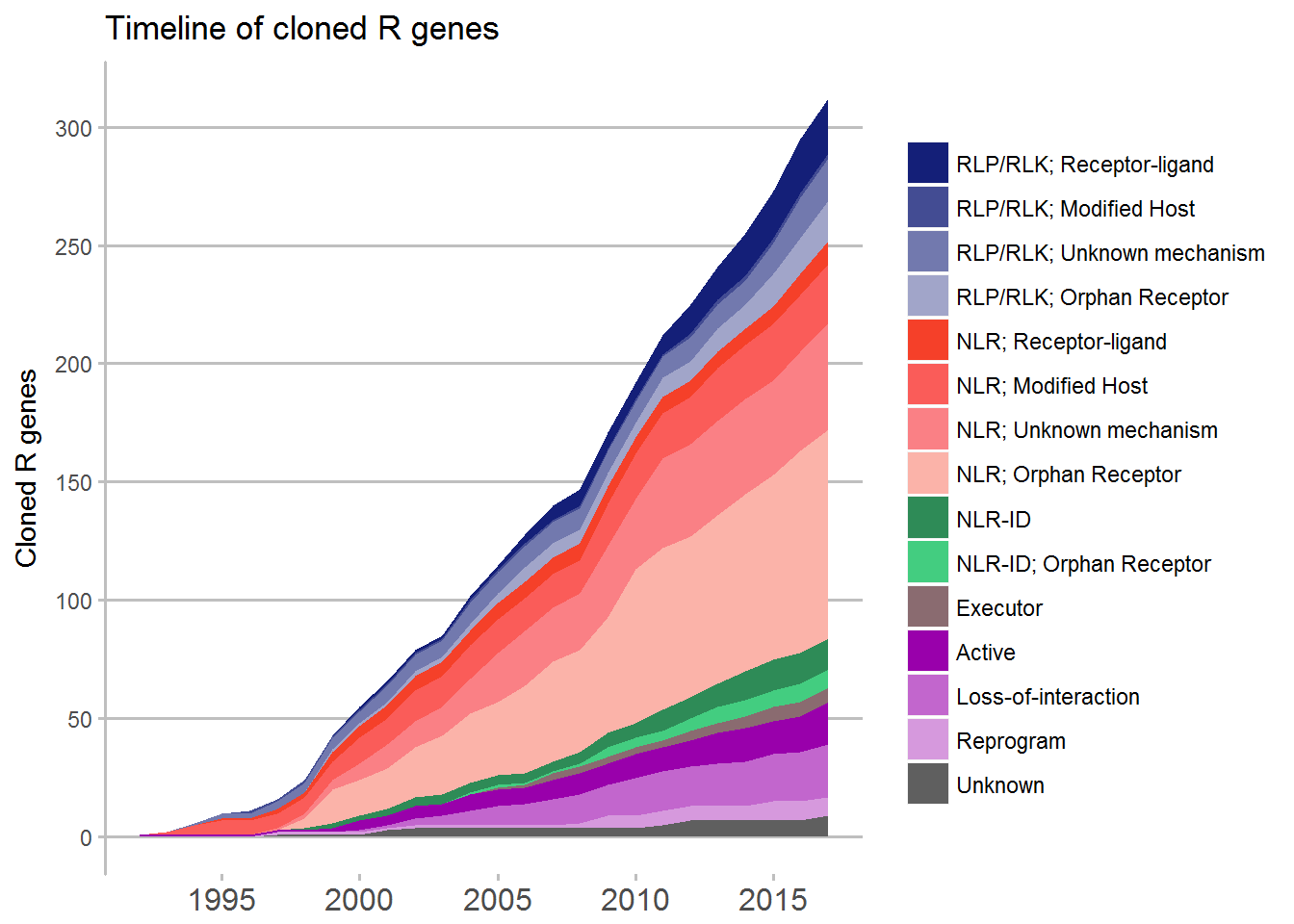
Unpublished figures
There is a lot more that can be done with the supplemental dataset. For example is these two graphs that did not make the paper.
Host vs pathogen
Again we grouped the same species together as before, and then plot the type of pathogen against which a cloned R gene is present against the host plant. From this data we can see either research bias for certain pathosystems, or a reflection of actual pathogen pressure (or both).
# Create a new dataframe
Species_Kingdom <- Data %>%
  filter(!is.na(Review)) %>% # Remove everything that is duplicated
  group_by(Host, Kingdom) %>%
  summarize(counts = n())

# Rename the species to reduce the number of categories
Species_Kingdom$Host[which(Species_Kingdom$Host == "Nicotiana benthamiana")] <- "Nicotiana"
Species_Kingdom$Host[which(Species_Kingdom$Host == "Nicotiana glutinosa")] <- "Nicotiana"
Species_Kingdom$Host[which(Species_Kingdom$Host == "Tobacco")] <- "Nicotiana"
Species_Kingdom$Host[which(Species_Kingdom$Host == "Eggplant")] <- "Other"
Species_Kingdom$Host[which(Species_Kingdom$Host == "Solanum americanum")] <- "Other"
Species_Kingdom$Host[which(Species_Kingdom$Host == "Cabbage")] <- "Other"
Species_Kingdom$Host[which(Species_Kingdom$Host == "Oilseed rape")] <- "Other"
Species_Kingdom$Host[which(Species_Kingdom$Host == "Pigeonpea")] <- "Fabaceae"
Species_Kingdom$Host[which(Species_Kingdom$Host == "Pea")] <- "Fabaceae"
Species_Kingdom$Host[which(Species_Kingdom$Host == "Soybean")] <- "Fabaceae"
Species_Kingdom$Host[which(Species_Kingdom$Host == "Medicago truncatula")] <- "Fabaceae"
Species_Kingdom$Host[which(Species_Kingdom$Host == "French Bean")] <- "Fabaceae"
Species_Kingdom$Host[which(Species_Kingdom$Host == "Cowpea")] <- "Fabaceae"
Species_Kingdom$Host[which(Species_Kingdom$Host == "Apple")] <- "Other"
Species_Kingdom$Host[which(Species_Kingdom$Host == "Grapevine")] <- "Other"
Species_Kingdom$Host[which(Species_Kingdom$Host == "Hop")] <- "Other"
Species_Kingdom$Host[which(Species_Kingdom$Host == "Myrobalan Plum")] <- "Other"
Species_Kingdom$Host[which(Species_Kingdom$Host == "Black Pepper")] <- "Other"
Species_Kingdom$Host[which(Species_Kingdom$Host == "Norway spruce")] <- "Other"
Species_Kingdom$Host[which(Species_Kingdom$Host == "Sorghum")] <- "Other"

# Order the pathogen types
Species_Kingdom <- transform(Species_Kingdom,
                      Kingdom  = factor(
                        Kingdom ,
                        levels=c("Viral", "Bacteria", "Oomycete", "Plant", "Fungi", "Nematode", "Insect", "Other"),
                        ordered =TRUE))

#Plot the data
ggplot(data = Species_Kingdom, aes(x = Host, y = counts, fill = Kingdom)) +
  geom_bar(stat = "identity") +
  ggtitle("R genes / host / pathogen-type") +
  scale_x_discrete(limits = c("Arabidopsis", "Fabaceae", "Flax", "Melon", "Lettuce", "Sugar beet", "Nicotiana", "Pepper", "Potato","Tomato", "Barley", "Maize", "Rice", "Wheat", "Other")) +
  scale_fill_manual(values = c("#1B9E77", "#D95F02", "#7570B3", "#E7298A", "#66A61E", "#E6AB02", "#A6761D", "#666666")) +
  scale_y_continuous(breaks = c(0, 10, 20, 30, 40, 50, 60)) +
  guides(fill = guide_legend(title = NULL)) +
  ylab("Cloned R genes") +
  theme(panel.background = element_rect(fill = NA),
        panel.grid.major = element_line(colour = "#BFBFBF", size = 0.8),
        panel.grid.major.x = element_line(colour = NA),
        axis.line.y = element_line(color = "#BFBFBF", size = 0.8),
        axis.ticks.y = element_line(color = "#BFBFBF", size = 0.8),
        axis.ticks.x = element_line(color = "#BFBFBF", size = 0.8),
        axis.text.x = element_text(angle = 60, hjust = 1, size = 12),
        axis.title.x=element_blank())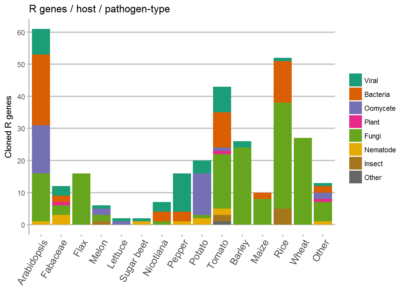
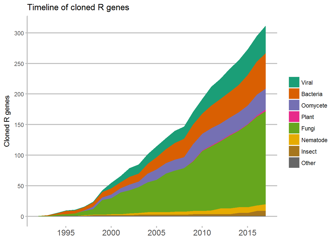
Host vs pathogen timeline
Likewise, in this timeline of cloned R genes against different types of pathogens we may see a reflection of which pathogens have been important to study, or a research bias.
# Create a new dataframe
data.count <- count(Data, Timeline, Kingdom)

year <- c(1992:2017)
kingdom <- unique(data.count$Kingdom)[1:8]
year.list <- c()
kingdom.list <- c()
n.list <- c()


for (y in year){
  for (k in kingdom){
    year.list = c(year.list, y)
    kingdom.list = c(kingdom.list, k)
    if (length(data.count$n[which(data.count$Timeline==y&data.count$Kingdom==k)])==0){
      n.list = c(n.list,0)
    } else{
      n.list = c(n.list, data.count$n[which(data.count$Timeline==y&data.count$Kingdom==k)])
    }

  }
}

TimelineKingdom <- data.frame(Timeline = year.list, Kingdom = kingdom.list, count = n.list)

rm(data.count)
rm(n.list)
rm(k)
rm(kingdom)
rm(kingdom.list)
rm(y)
rm(year)
rm(year.list)

TimelineKingdom <- TimelineKingdom %>%
  group_by(Kingdom) %>%
  mutate(running_total = cumsum(count))

# Order the pathogen types
TimelineKingdom <- transform(TimelineKingdom,
                    Kingdom  = factor(
                      Kingdom ,
                      levels = c("Viral", "Bacteria", "Oomycete", "Plant", "Fungi", "Nematode", "Insect", "Other"),
                      ordered = TRUE))

#Plot the data
ggplot(data = TimelineKingdom, aes(x = Timeline, y = running_total, fill = Kingdom)) +
  geom_area(position = "stack") +
  ggtitle("Timeline of cloned R genes") +
  scale_x_continuous(breaks = c(1995, 2000, 2005, 2010, 2015),
                     labels = c("1995", "2000", "2005", "2010", "2015")) +
  guides(fill = guide_legend(title = NULL)) +
  scale_fill_manual(values = c("#1B9E77", "#D95F02", "#7570B3", "#E7298A", "#66A61E", "#E6AB02", "#A6761D", "#666666")) +
  ylab("Cloned R genes") +
  scale_y_continuous(breaks = c(0, 50, 100, 150, 200, 250, 300)) +
  theme(panel.background = element_rect(fill = NA),
        panel.grid.major = element_line(colour = "#BFBFBF", size = 0.8),
        panel.grid.major.x = element_line(colour = NA),
        axis.line.y = element_line(color = "#BFBFBF", size = 0.8),
        axis.ticks.y = element_line(color = "#BFBFBF", size = 0.8),
        axis.ticks.x = element_line(color = "#BFBFBF", size = 0.8),
        axis.text.x = element_text(size = 12),
        axis.title.x=element_blank())